37 Thoughts About Color
May 24, 2022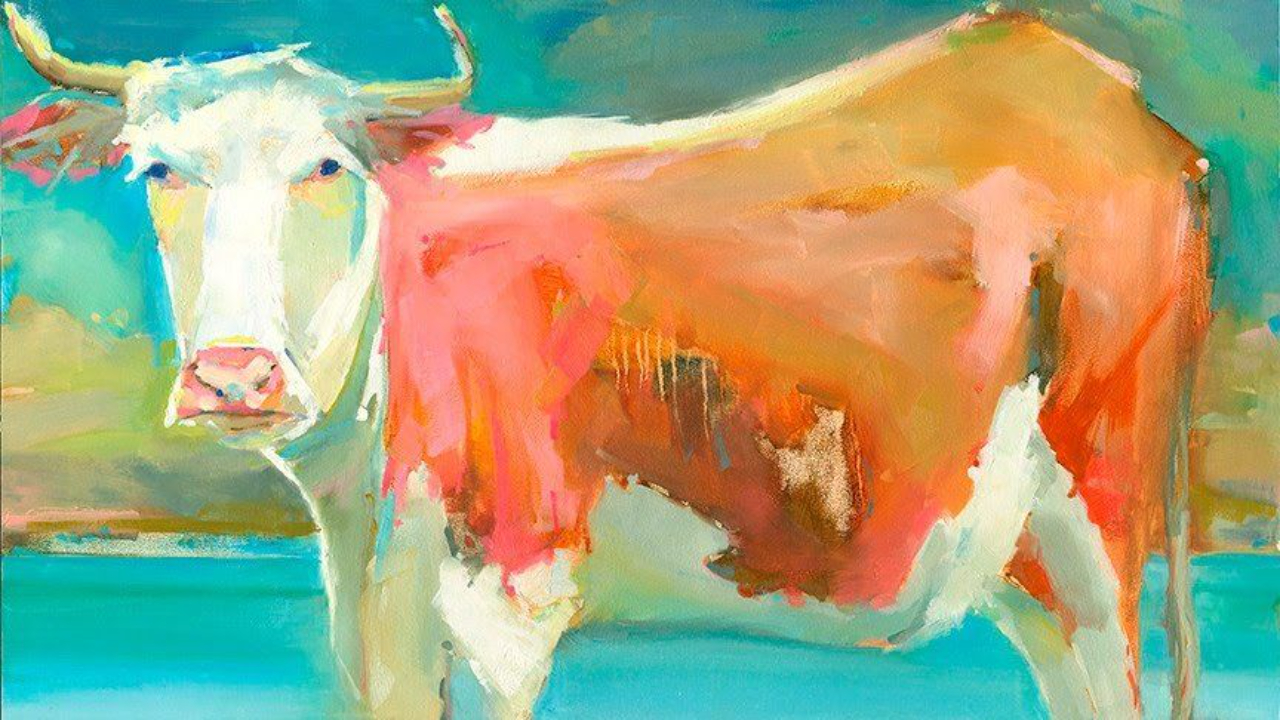
What a glorious day it has been. I planted my spring garden today and I am enjoying a breezy Florida late afternoon as I write this on my back porch.
My mind is on color.
I taught a wonderful, day-long color class yesterday. It is always a treat to be live with students since I mostly teach online these days. It was very special that 3 of my online Essential Elements students were actually at the class and I got to paint with them in person!
Today I gave myself an exercise to make a list of color musings to share with you - things I've come to learn about color and how I use it.
Here are 37 things that came to mind:
- Sir Isaac Newton passed a beam of light through a glass prism. It broke in the colored bands, and later became known as the color spectrum (and lead to the color wheel).
- The definition of color = hue, value & chroma
- Hue = color. That’s all
- Good value means you can use any color you want.
- Knowing chroma will help mix better color.
- Color is relative to whatever color is next to it.
- Without light there is no color.
- Color can be the subject of a painting (think abstracts).
- Knowing the properties of each tube of your paint will help you mix better.
- Using only analogous colors, warm colors or only cool colors will make a more unified painting.
- Inorganic colors produce more local color.
- When painting bright colors, keep the value close.
- Organic colors produce more intense color.
- Your own color mixing bootcamp: Use the 3 primaries and white to mix all your colors
- Gray = red, blue & yellow
- Adding white to a mixture will cool it down.
- Colors have different values right out of the tube.
- When mixing dark colors add a touch of white to see which color it is leaning toward.
- Mix your pigments with a palette knife and not your brush to avoid gloppy-brush-syndrome.
- Color speaks to our emotions.
- Color can be used to emphasize an area - like your focal point.
- Color can be used to create form.
- Complimentary colors just look good together.
- Complimentary colors mixed together = gray
- Adding white too early can lead to mud.
- Place warm spots of color near cool ones, and cool spots near warm ones.
- When adding a new color to a painting, look for other areas of the painting to add that color.
- The key to more natural greens is mixing in a warm color (red or orange).
- Indian Yellow will brighten a dull, lifeless area of my painting.
- I often use Ultramarine Blue for a sky.
- Indanthrone Blue is my newest favorite color.
- I splurge on ultra-saturated, premium quality, GOLDEN Acrylic Paints.
- I save money using white gesso instead of titanium white in my acrylic paintings.
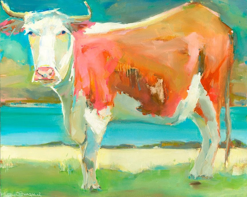
- Orange and pink look really good together.
- I use blue the most.
- I start my panting by “drawing” in transparent oxide orange.
- Most of my paintings are a majority of grays ( a mixture of red, blue & yellow.
Wishing you a most colorful week!
GRAB THIS LIST AS A PRINTABLE GUIDE!